Standard Model Bio
From one pitch deck to an entire brand — designed by hand, scaled with AI.
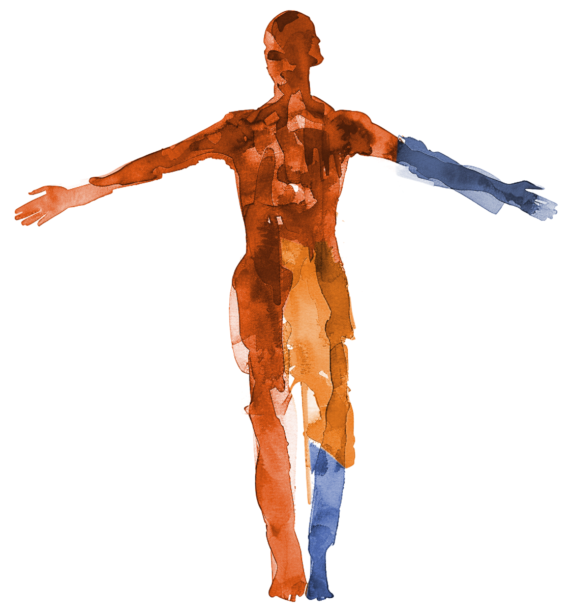
Standard Model Bio hired me to design the look and feel for a single pitch deck. The foundations I established there — palette, typography, layout principles — have since grown into a complete identity: a living design system, a library of investor and partner presentations, and a fully custom website — all built on the same foundation, all maintained by one designer.
A compelling story, no identity to tell it.
Early-stage biotech is a credibility game. Standard Model had a compelling story — a foundation model for human biology, trained on genomic, imaging, and longitudinal patient data — but nothing to make it look real: no palette, no logo, no landing page. They needed a brand from scratch, one that could start as a mini-brand to help the founders meet early investors and mature into a real system: one that could carry a website, docs, and pitch after pitch without losing coherence.
Essence, then system — by hand. Then scale, with AI.
Every engagement starts with essence: understanding what a company actually is before deciding what it should look like. From that came a core identity built around a single idea — behind every data point is a human story. A palette that refuses biomedicine's antiseptic white-and-blue, holding cool scientific authority and warm human presence at equal weight. Organic, Matisse-inspired forms that flow into one another the way the company's model connects fragmented biomedical data. A brand mark that encodes the actual thesis. This is the part no tool does for you — presented to stakeholders and approved before a single line of code existed. The CEO's response: extend it to everything.
Then, scale. Using Claude Code, I translated the brand into a coded design system and built the company's website from the ground up — no template, no dev team, no handoff loss between “the design” and “the build,” because the designer was the builder. AI didn't design any of it. It let one designer ship what used to take an agency.
One system, carrying the whole company.
Every new pitch starts on-brand, the site evolves at the pace of the science, and the visual language scales as the company grows. I stay on as Standard Model's ongoing design partner — decks, website, social, and each new surface — holding the fidelity of the system so it speaks with one voice wherever it's seen. In practice, that's meant:
A mission worth building for.
Some engagements matter beyond the craft. Standard Model exists to predict the course of a patient's disease — turning genomic, imaging, and clinical data into a model of the whole human — so clinicians and drug developers can move faster from question or diagnosis to treatment, compressing the years between a trial and a therapy that reaches people.
That purpose — extending human life and easing suffering — is exactly the kind of thing I want my work attached to. I believe that this one life is all any of us gets, and what gives it meaning is doing work that leaves other people better off. Building the identity and system that let a company like this be understood and trusted is, to me, a genuinely worthwhile way to spend the effort.
The Deliverables
Eight surfaces · one systemThe organic language of data.
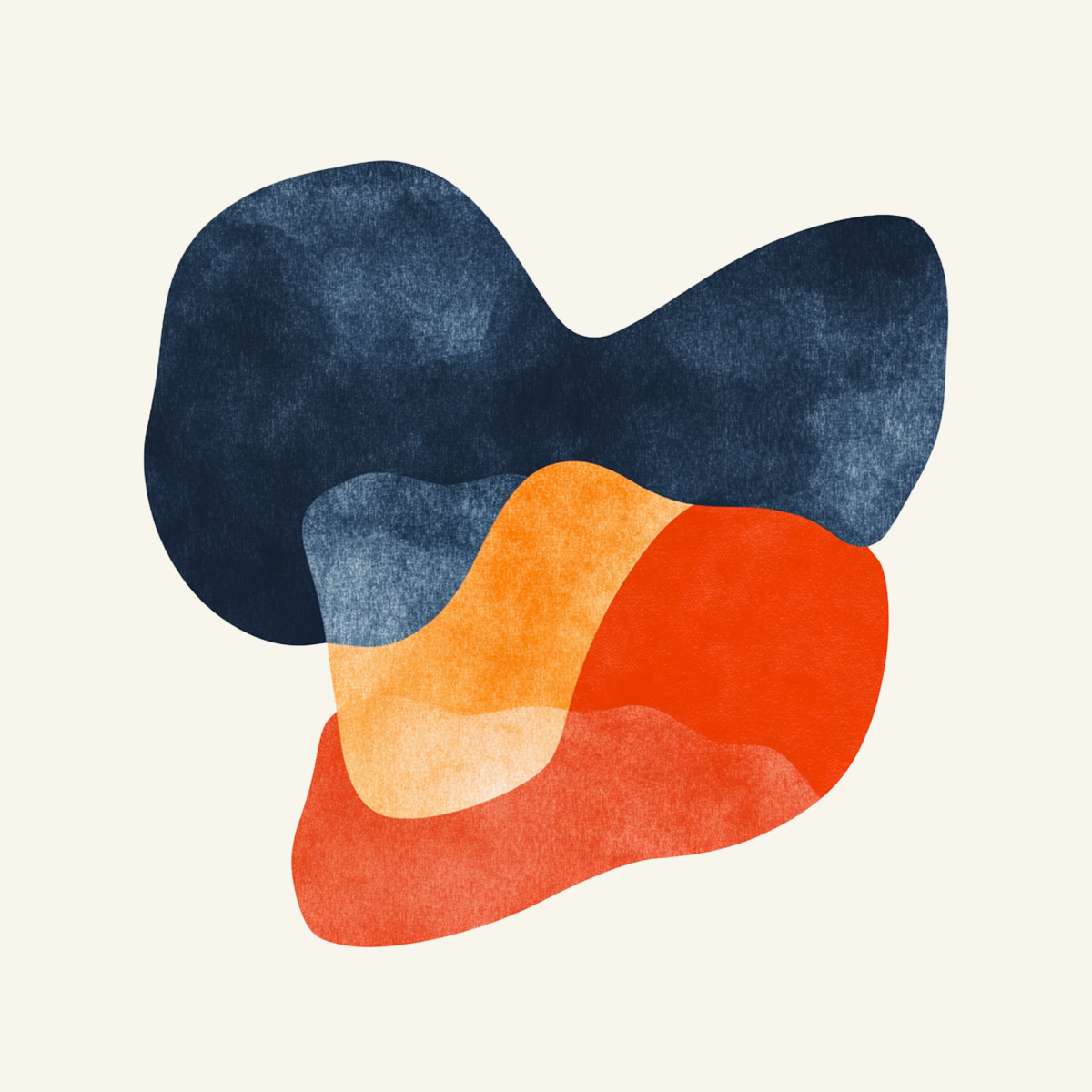
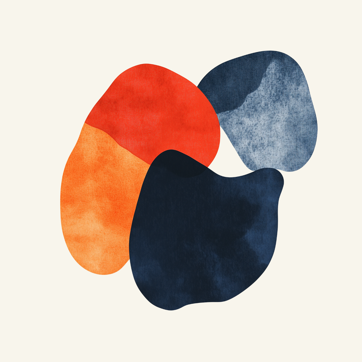
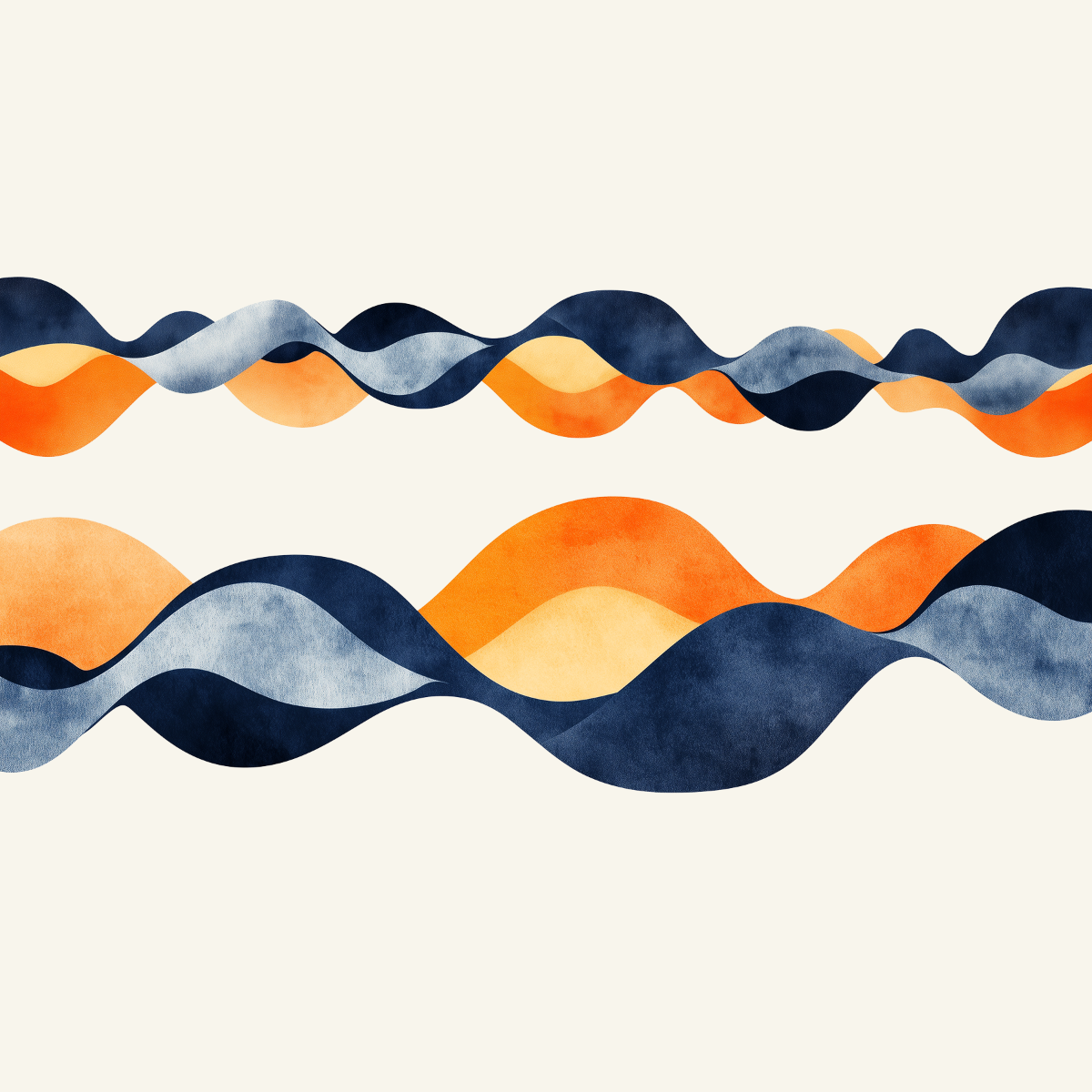
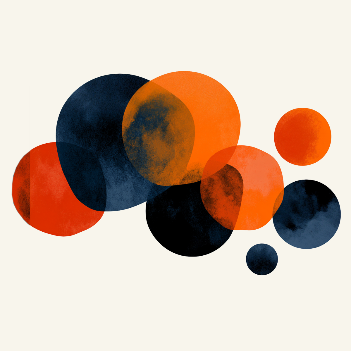
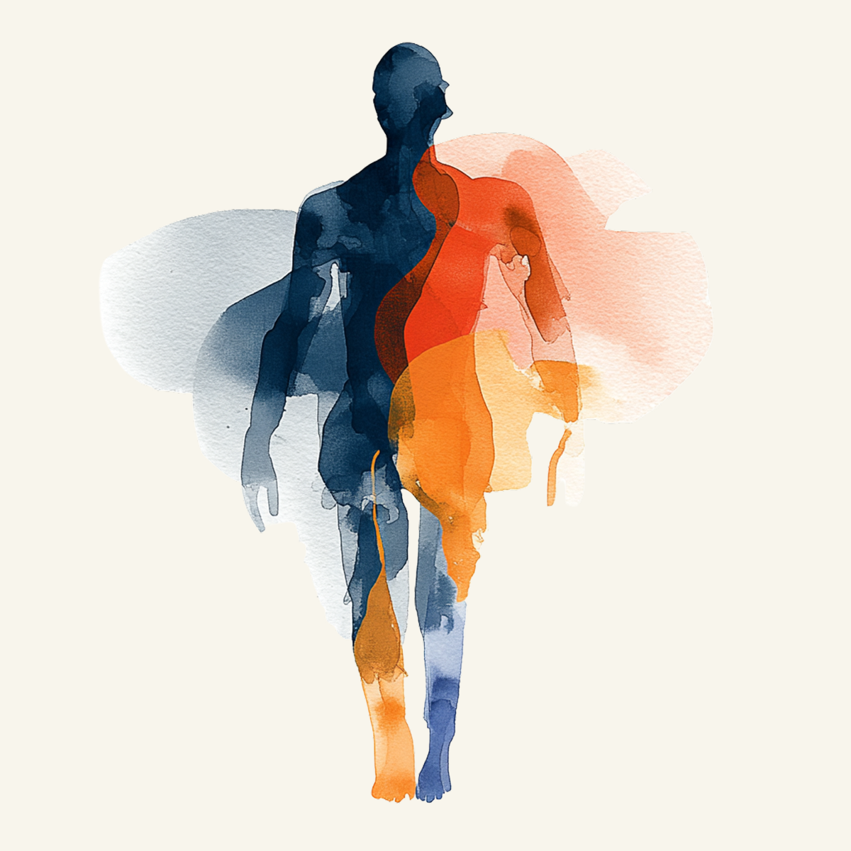
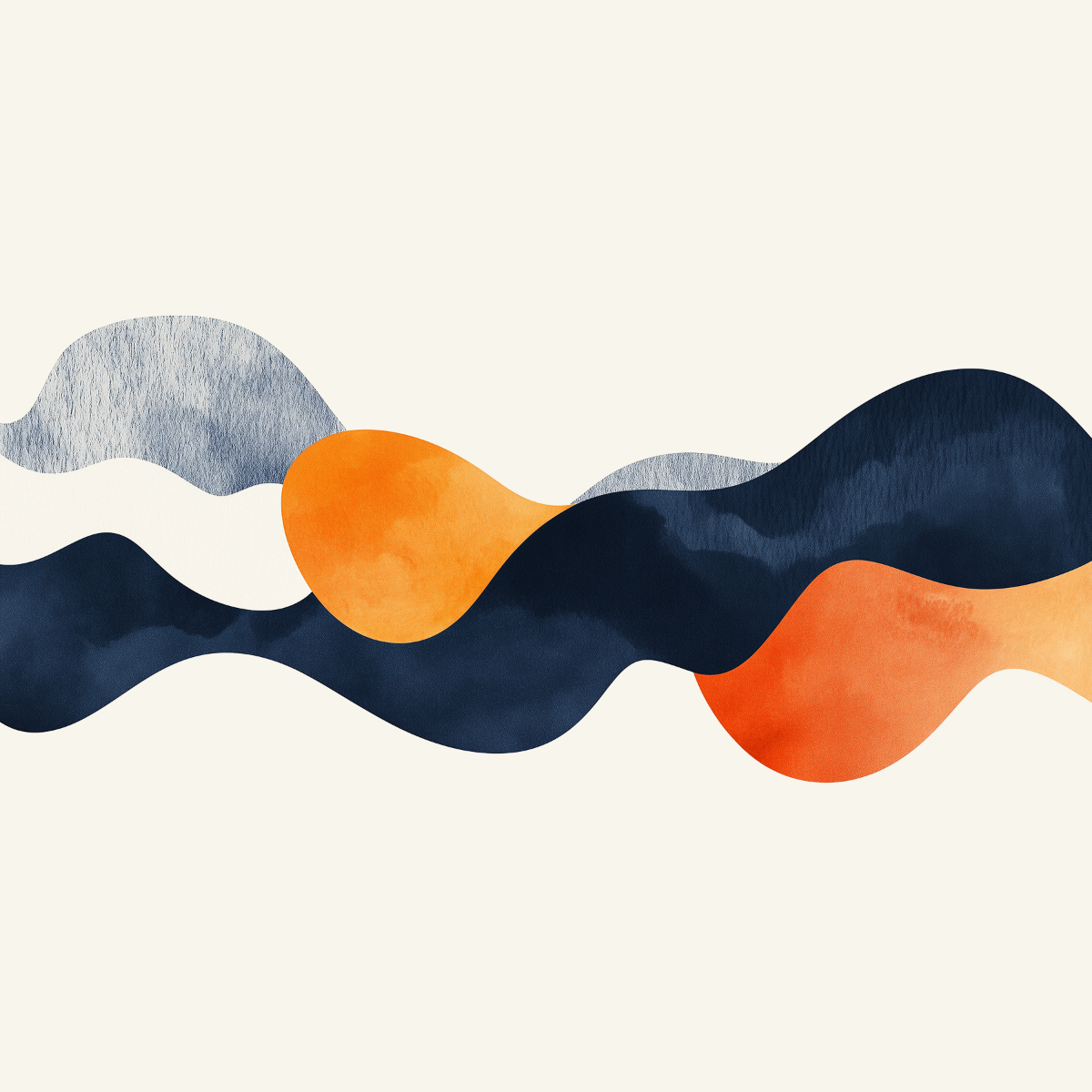
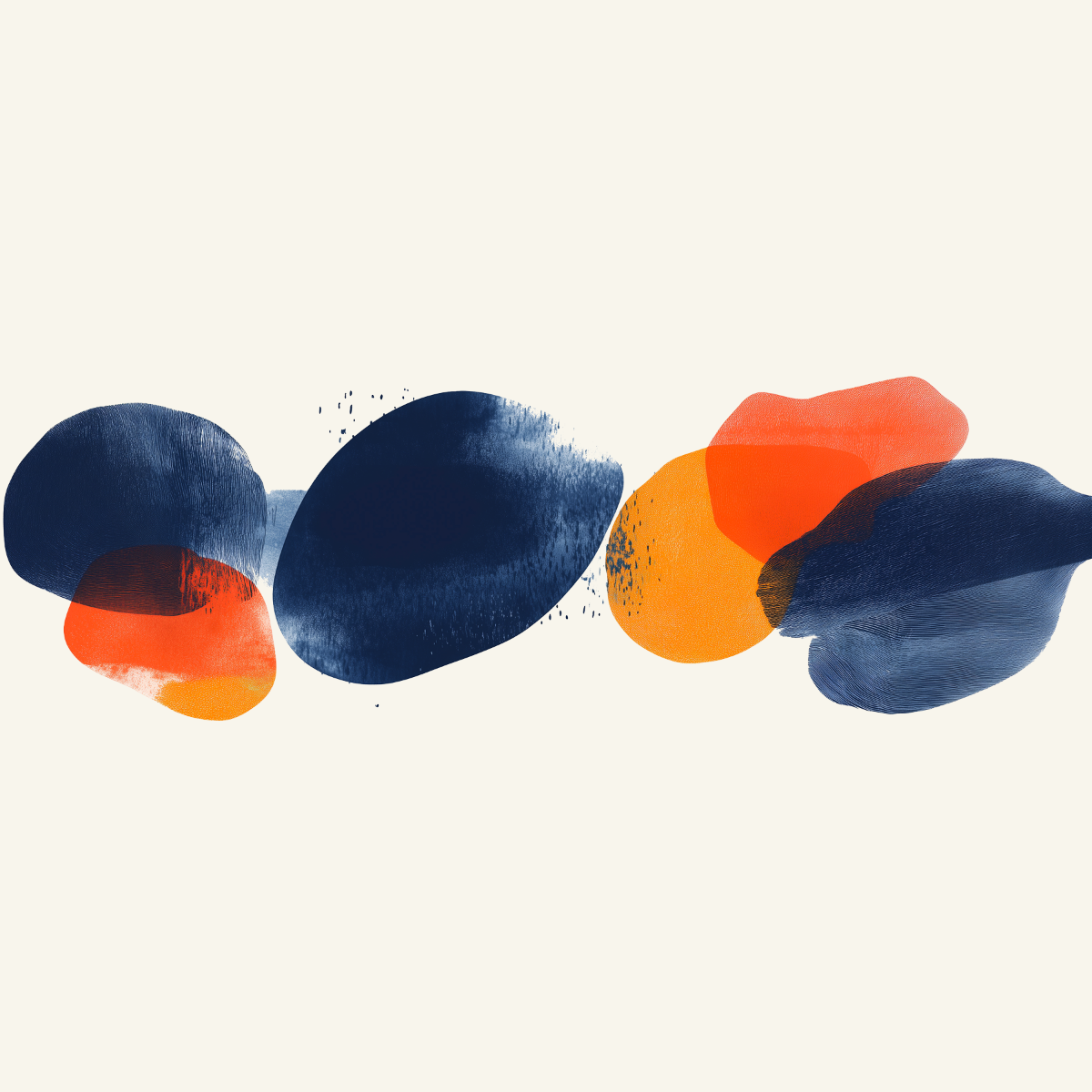
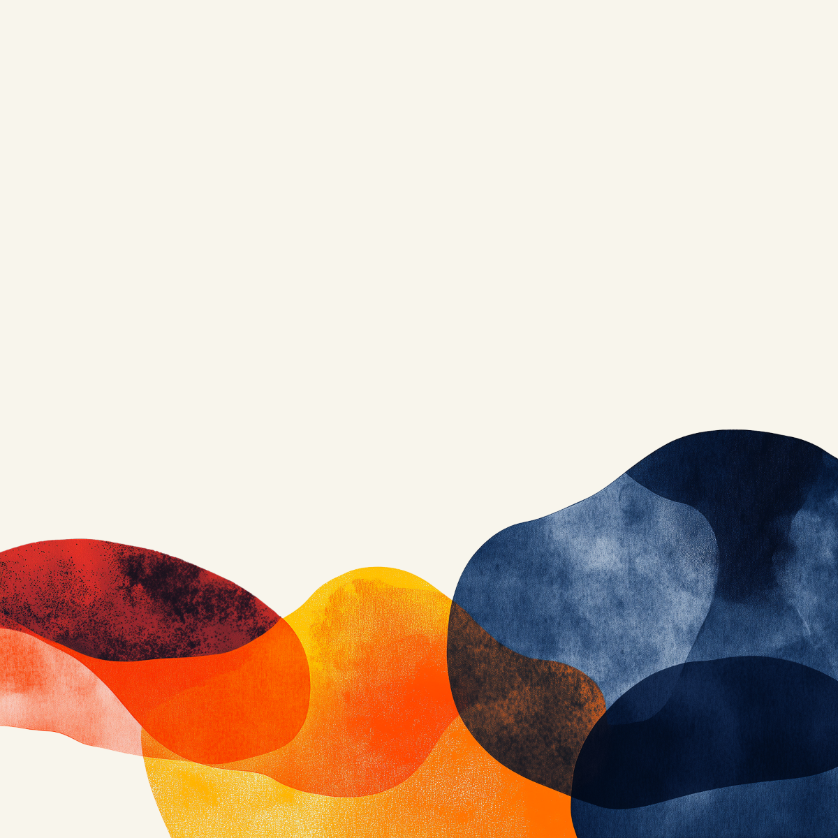
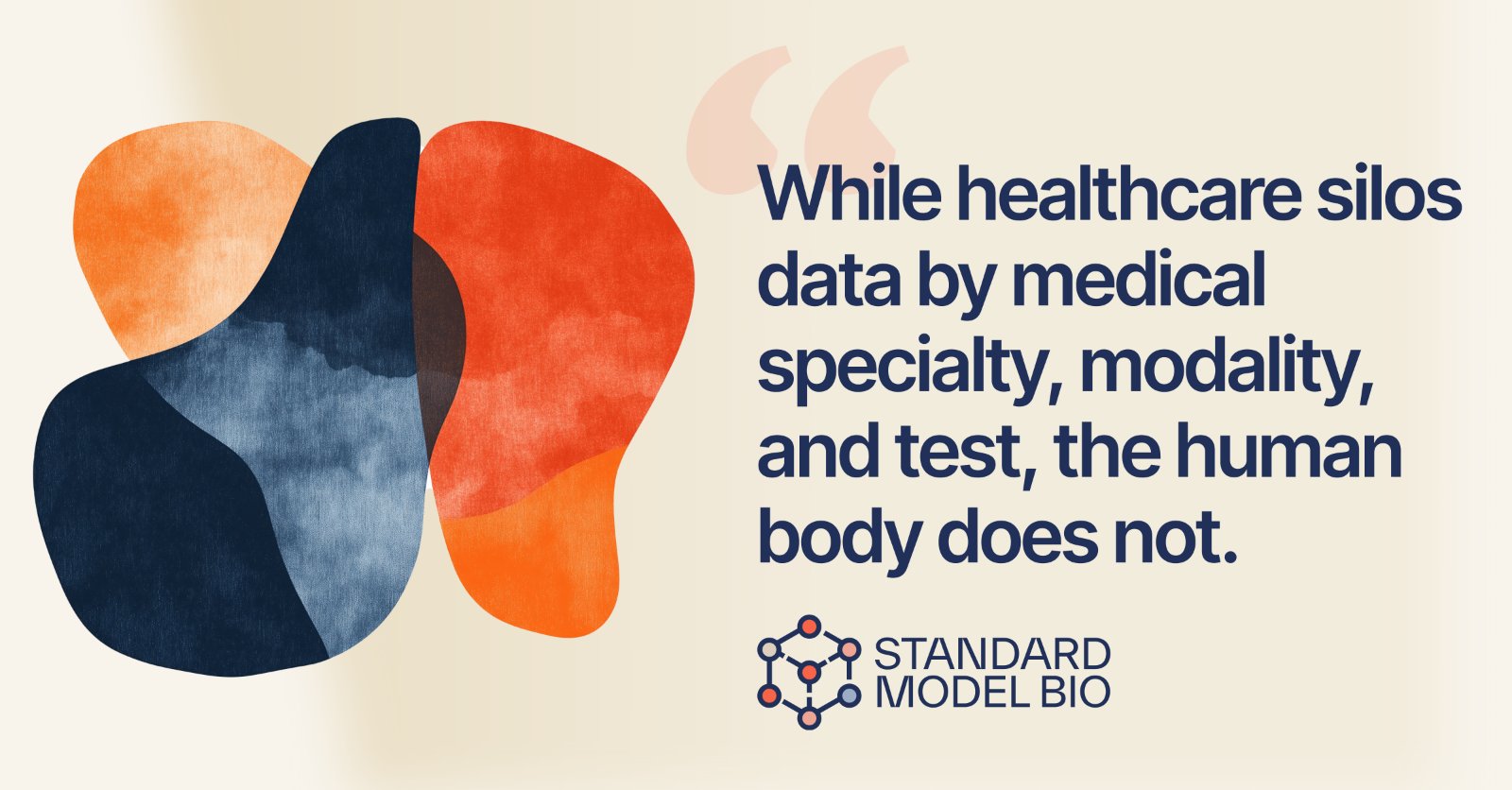
Standard Model is building one model of the whole human — fragmented biomedical data resolved into a single picture of a patient. I translated that ambition into a living visual language: organic, abstract forms, inspired by late-period Matisse, where simple flowing shapes carry profound meaning. The forms overlap and interact — warm oranges and reds meeting cooler blues, mixing new hues where they cross — the way a multimodal model fuses diverse measurements into a unified whole. They shift in scale too, from small cellular structures to sweeping whole-patient systems, and none stands alone: each flows into the next, an ecosystem where a change at one level ripples through the rest. Watercolor textures and transparent overlays echo the layered complexity of biology, and the negative space around each form is left to breathe — keeping the human body, not the lab, at the center.
The mission, built into the mark.
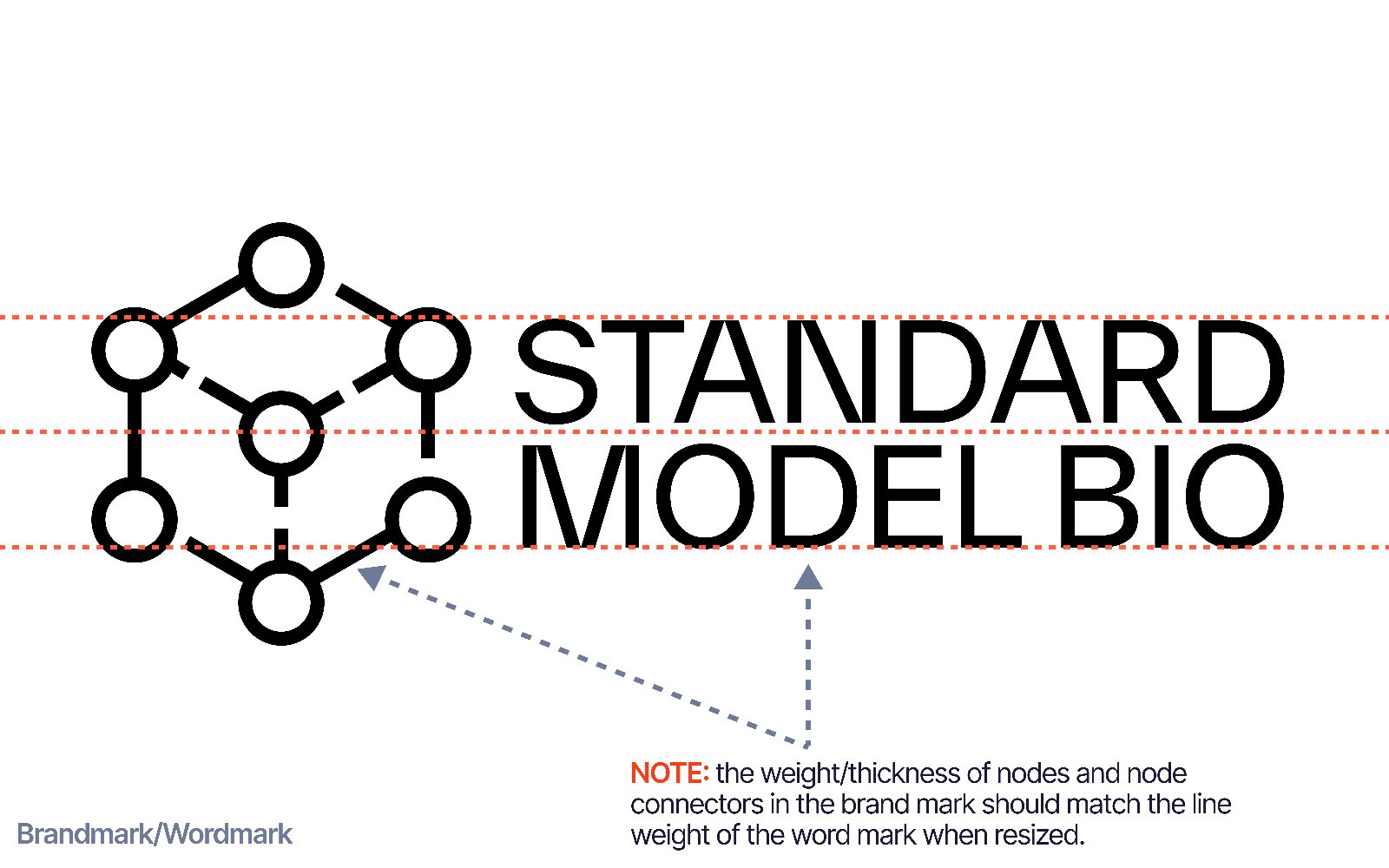
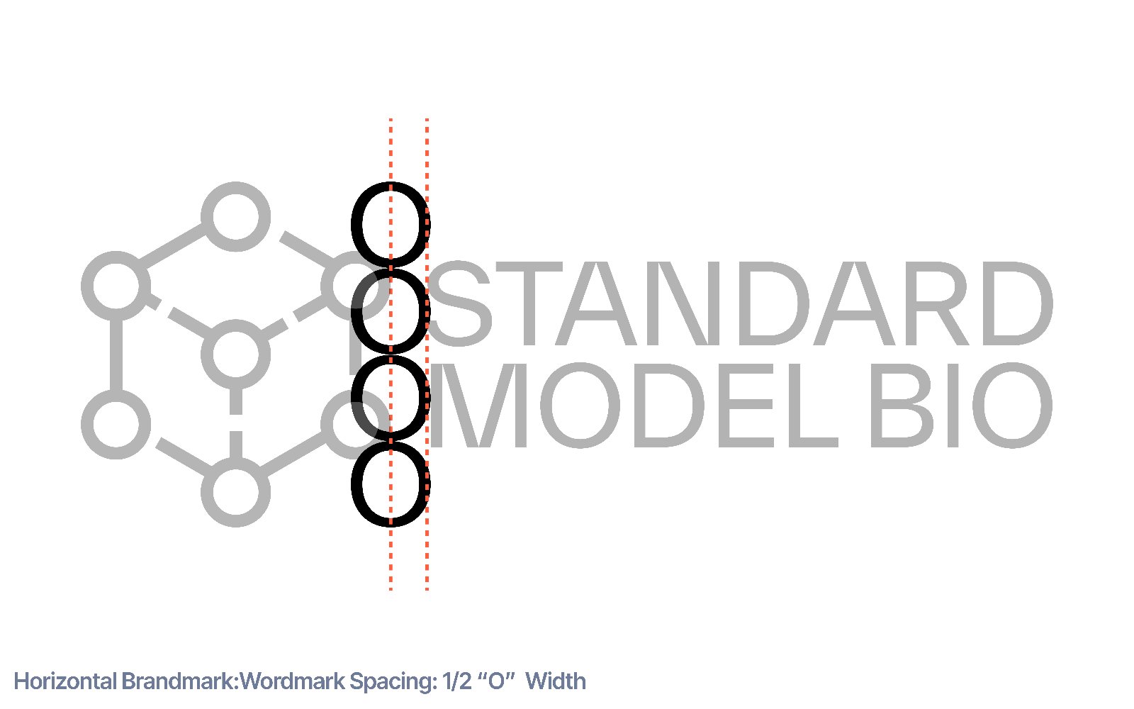
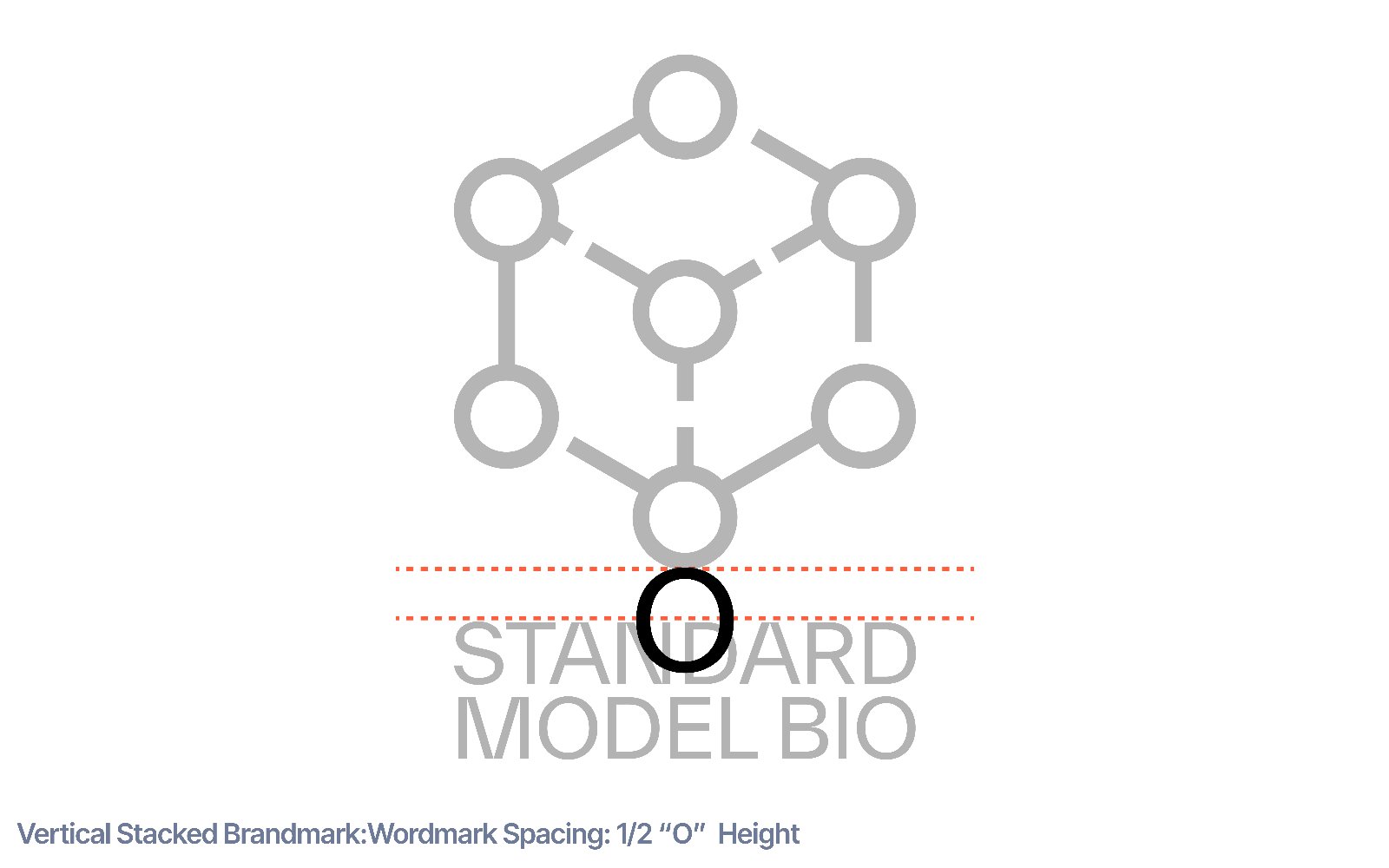
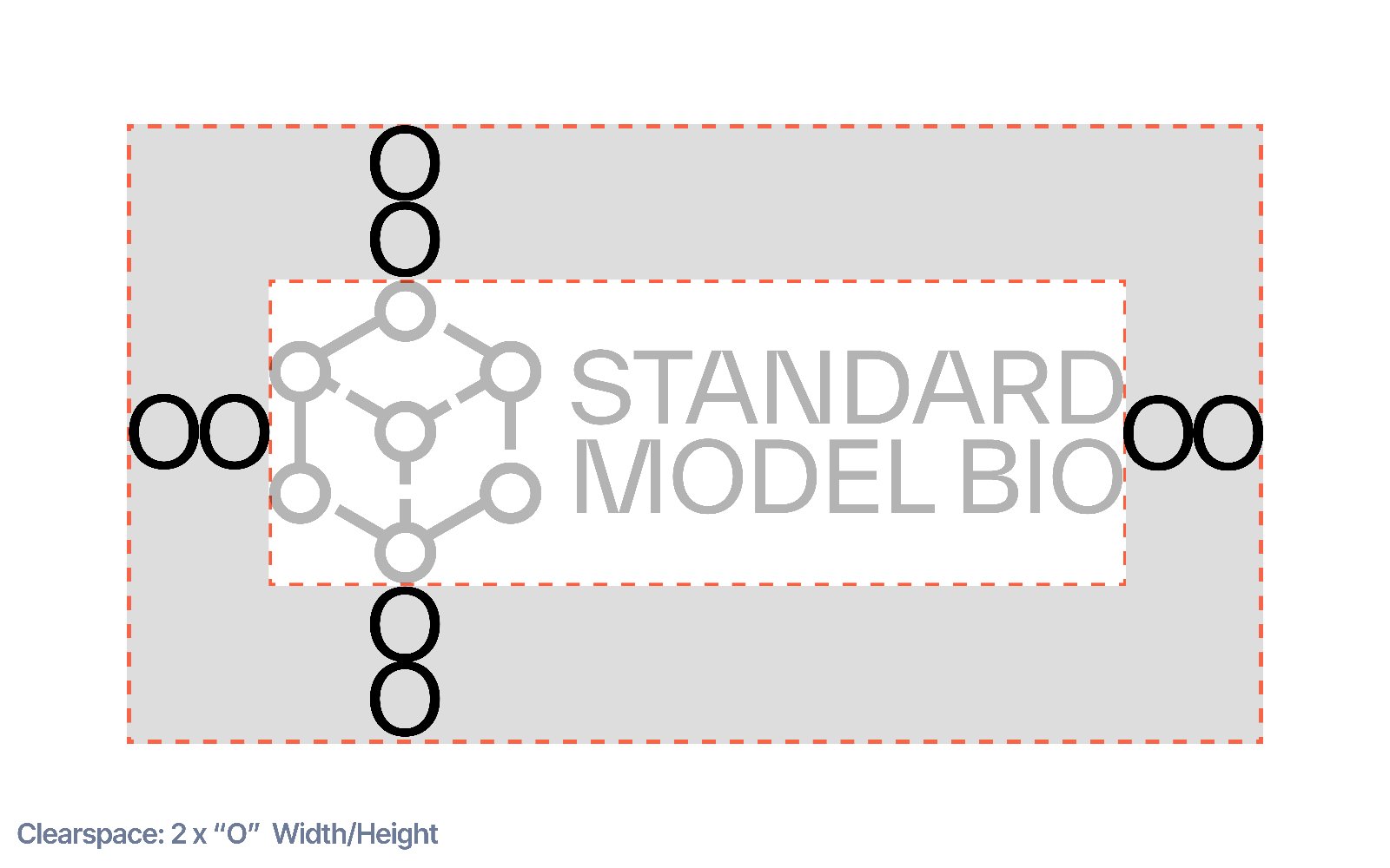
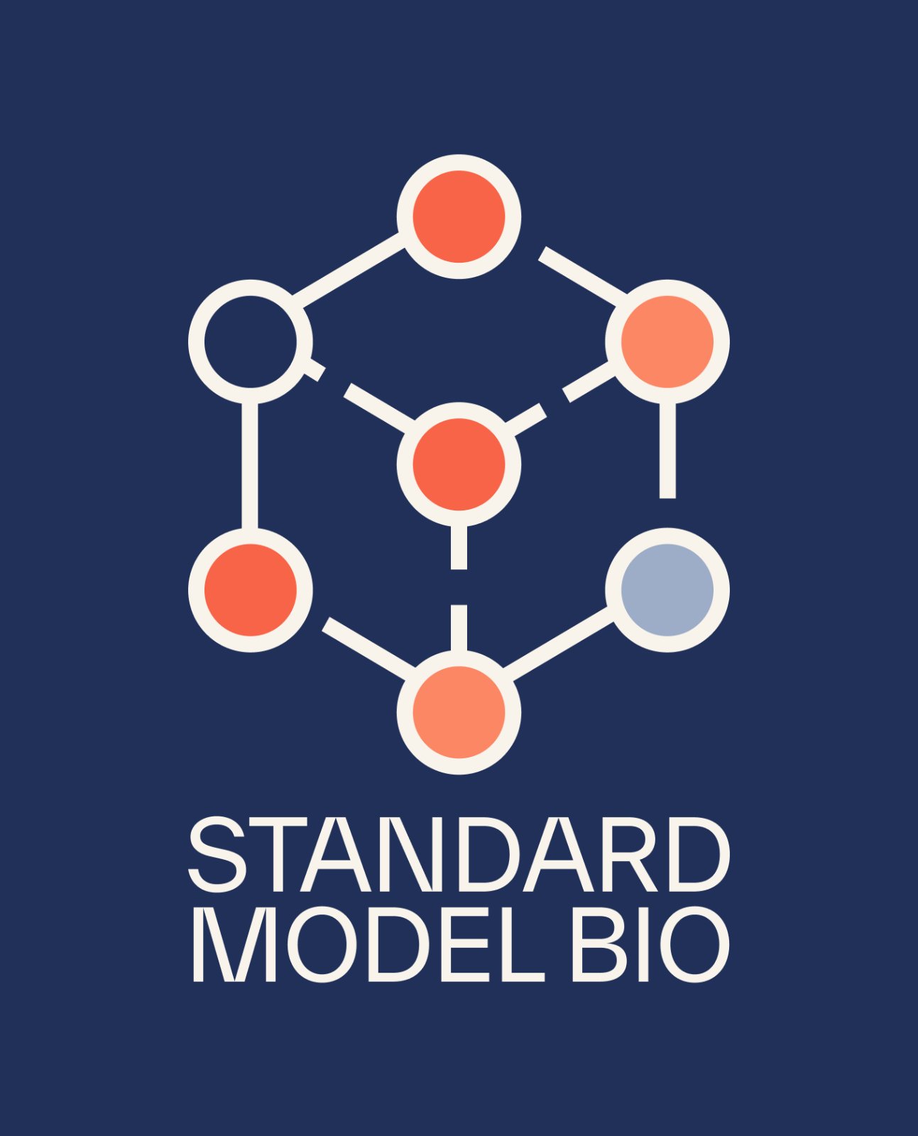
The company's thesis is encoded directly in its symbol: six nodes orbiting a central hub — at once a chemical-bond diagram and a data graph — every biomedical signal, at every scale, unified into one representation of a patient. The name borrows its authority from physics, where the Standard Model unifies every force under one theory; the mark makes the same claim for biology, held by one confident system of lockups on light and dark.
A palette drawn from the body.
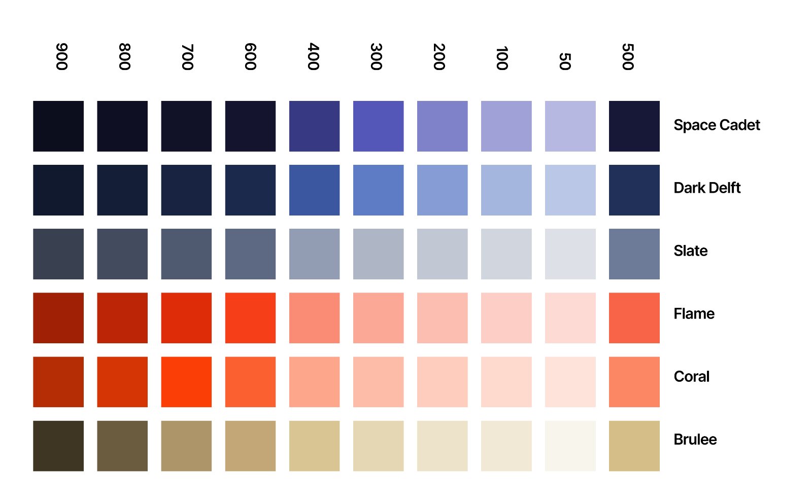
Six families that map straight onto human biology. Cool navies and slate carry the scientific authority — the clarity of the lab, the depth of the data — while warm flames and corals carry the human presence, from the blush of living tissue to the heat of physiological intensity, with a brûlée tan standing in for paper and skin. Cool and warm sit at equal weight, refusing biomedicine's usual clichés, because the science is real — and so is the person behind every measurement.
A custom set, drawn for the science.
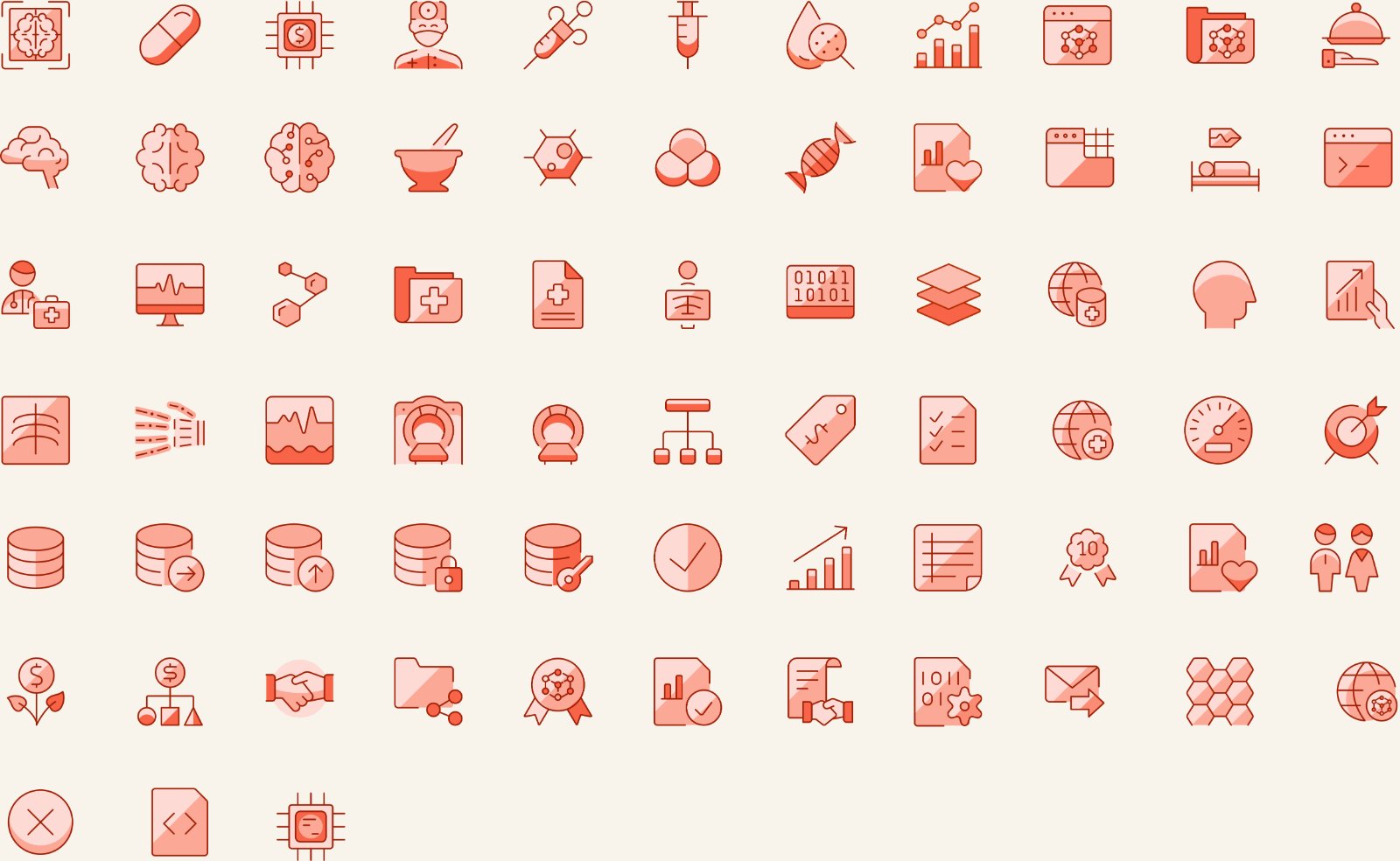
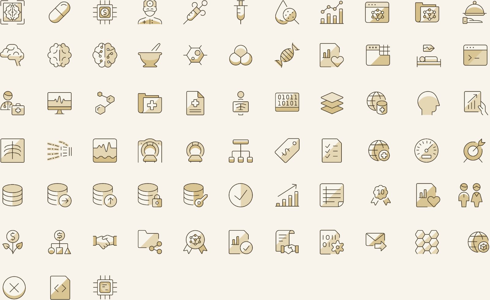
Sixty marks spanning the company's entire world — imaging, molecular biology, data and compute, and the clinical layer. One line weight, one corner radius, one palette, so any combination reads as a single voice across decks, the site, and the product. Unmistakably theirs — built from the science it describes.
From a Wix placeholder to a living flagship.
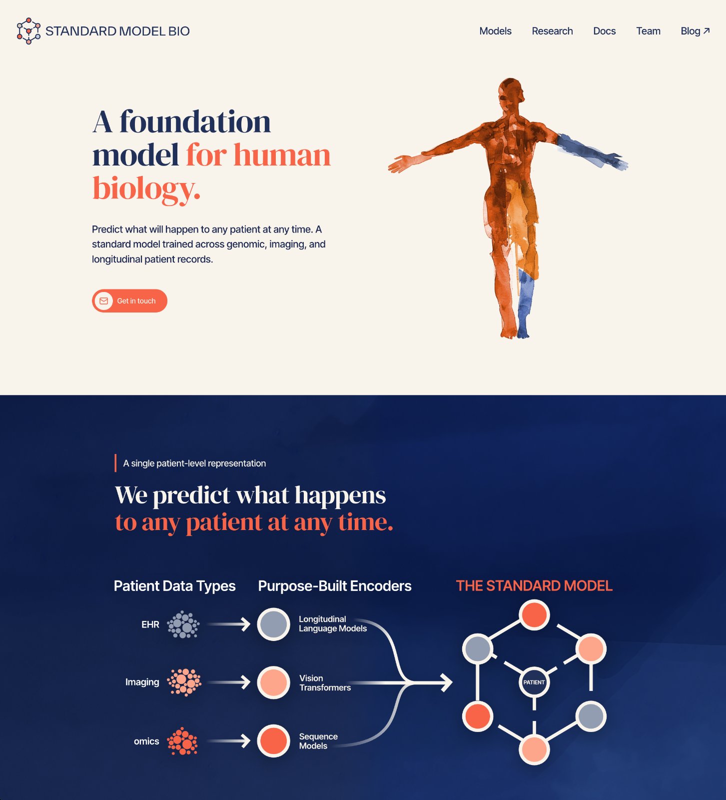
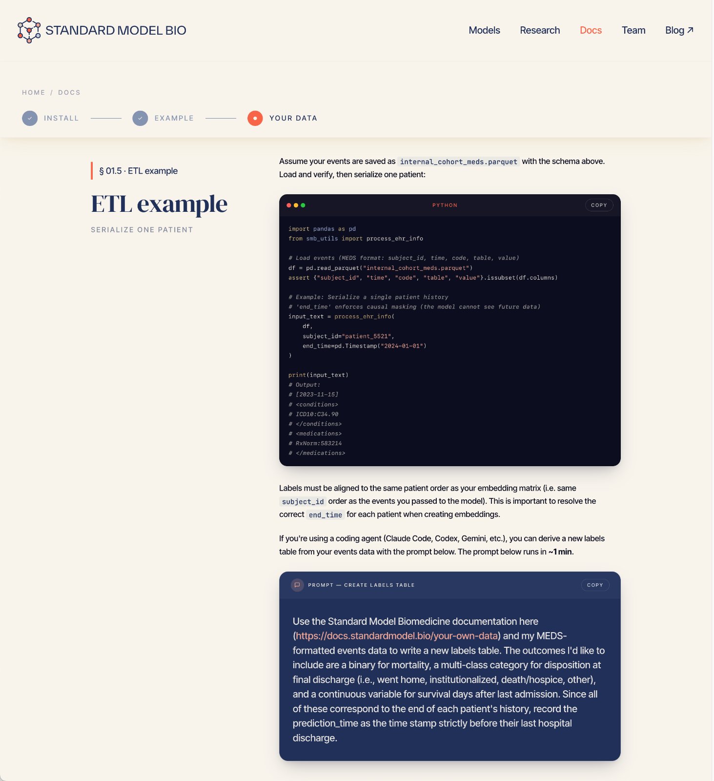
The first site was an off-the-shelf Wix template — enough to point investors somewhere real, but generic and unmistakably not the brand. I redesigned it screen by screen in Figma, folding in the identity — the molecular visuals, the full palette, the custom icon set — then moved from those designs into build with Claude Code.
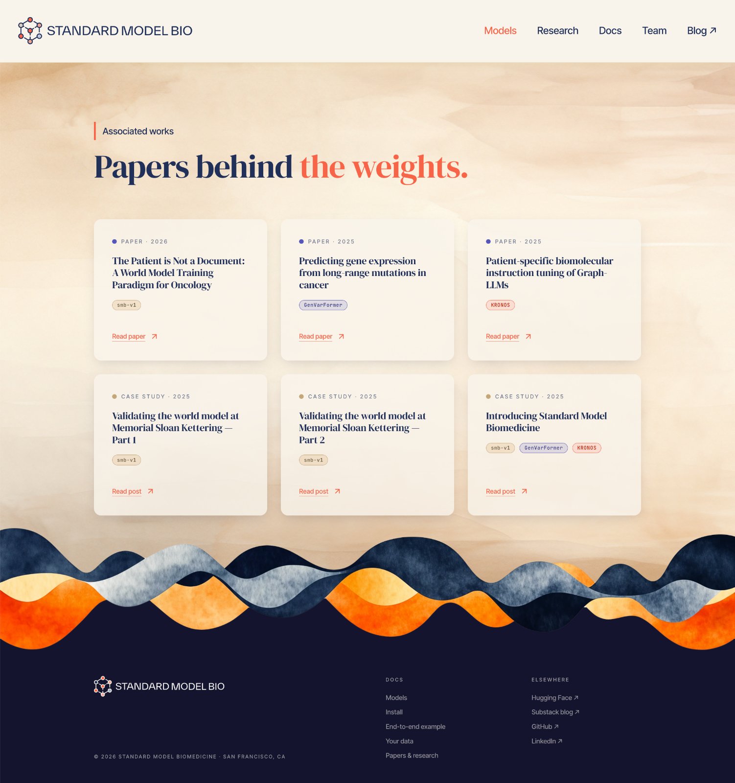
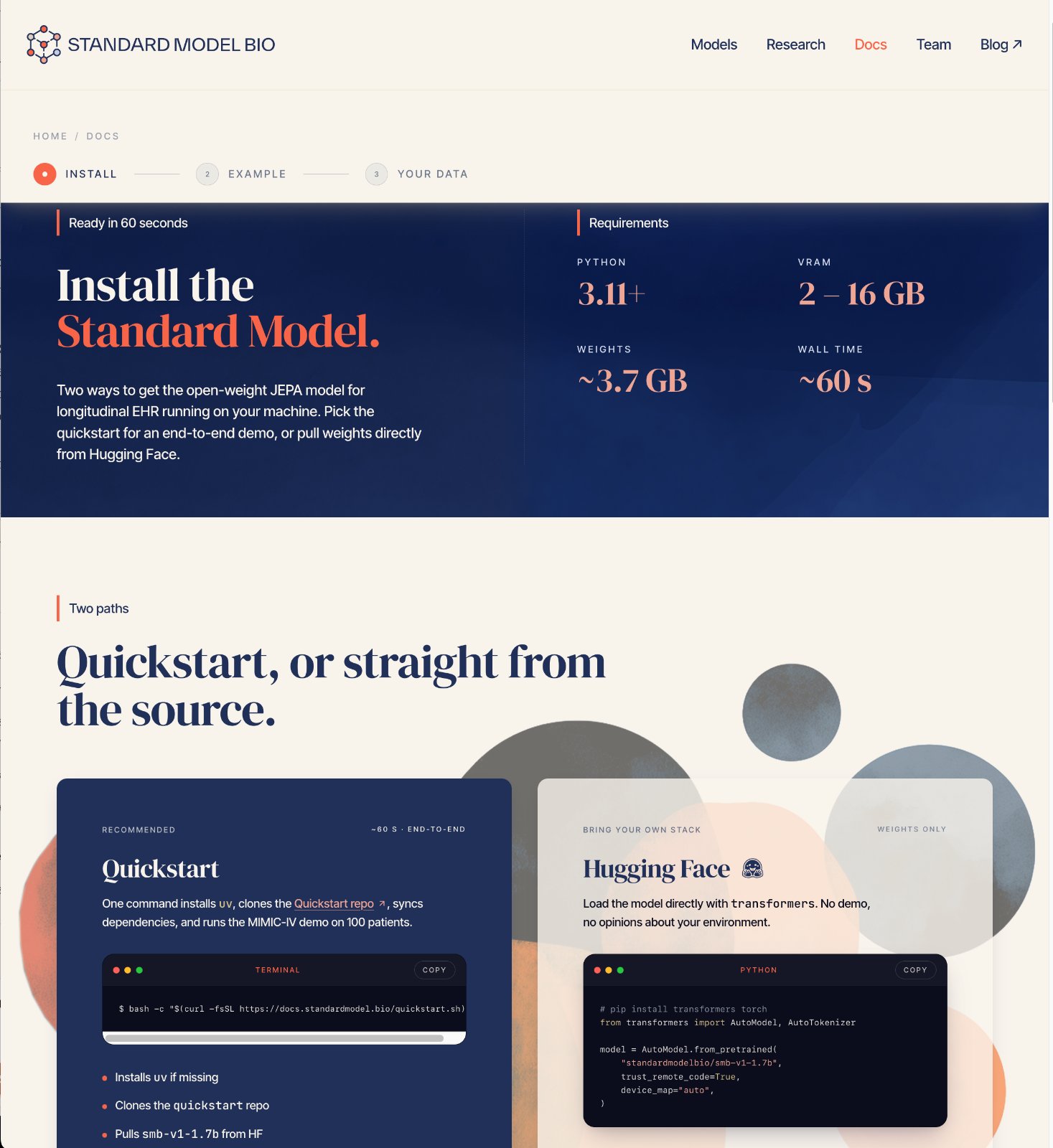
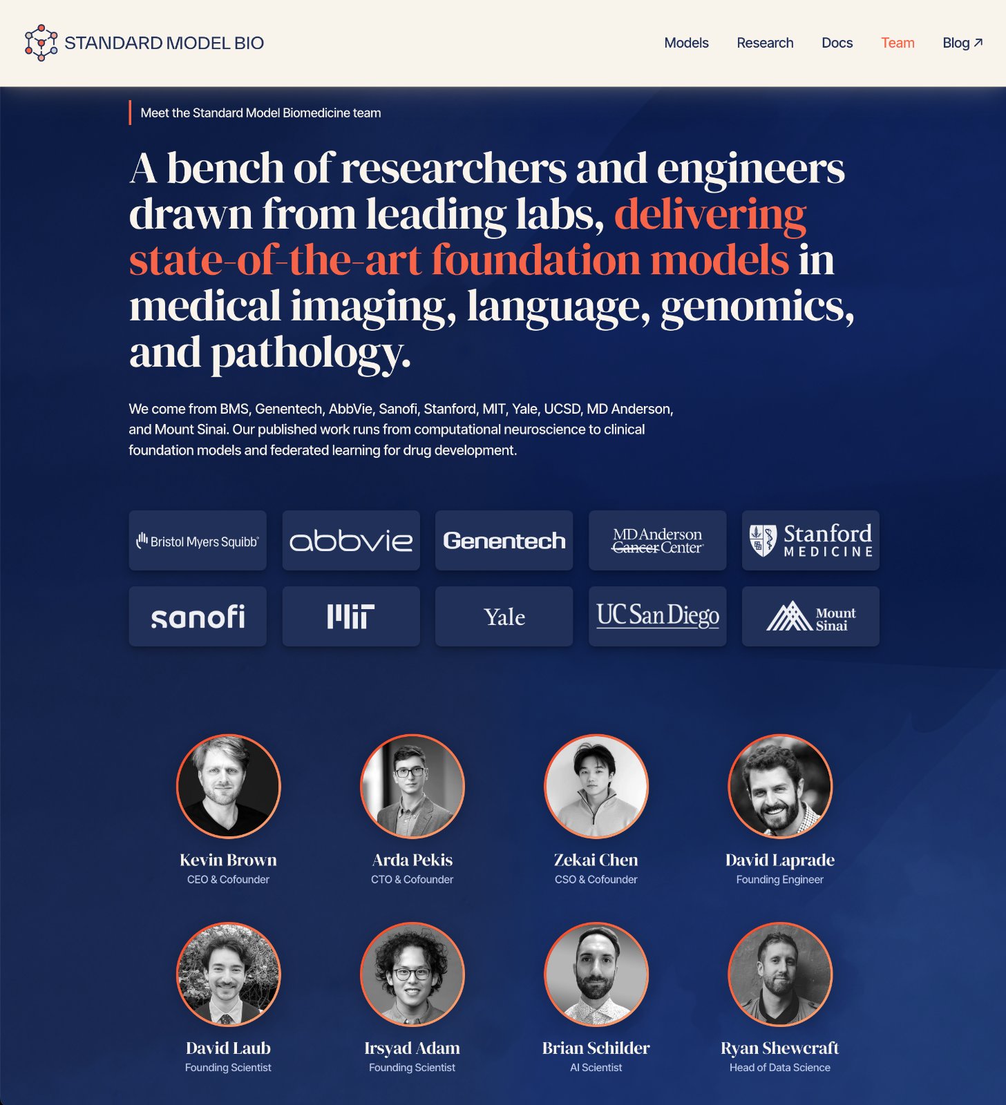
It hasn't stopped growing since. A handful of marketing pages became a site with real architecture: a technology section for the model itself, a product section for TrialFront, an indexed publications library, a news and events feed, and team pages — held together by a navigation with dropdowns on desktop and a proper menu on small screens. I reworked the UX and UI around that expansion rather than bolting new pages onto the original layout, so the company can keep adding without the structure giving way.
The craft deepened with it. The explanatory diagrams are inline SVG animated in CSS — the multi-scale stack assembling layer by layer, rows and nodes arriving in sequence — vector the whole way down, so they stay crisp at any size instead of being flattened into pictures. Narrated film now runs on the product page in a player I designed to the brand rather than defaulting to the browser's own controls. It is a living document, not a hand-off: it evolves at the pace of the science and holds brand fidelity on every release.
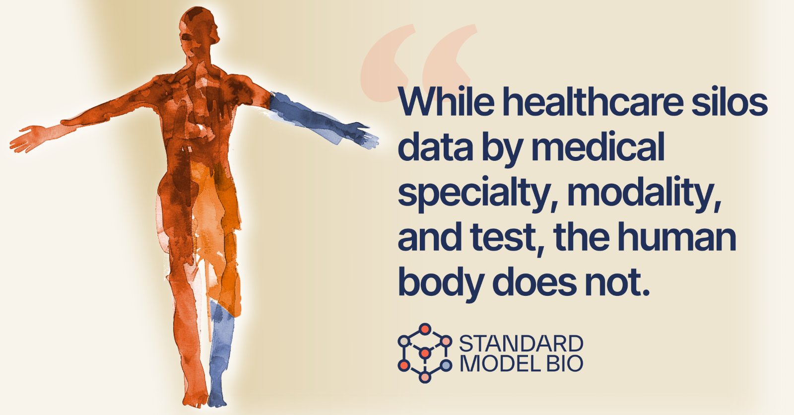
An always-on social presence.
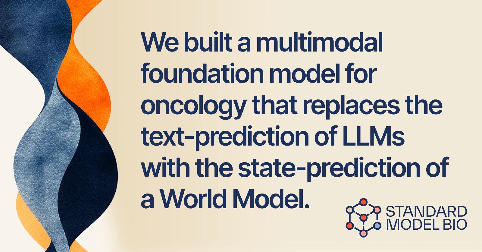
The system extends into social: a templated kit of profile marks, announcement cards, and quote posts with a consistent grid and type hierarchy — campaign-ready assets the team can ship on cadence while the brand reads as one voice on every platform.
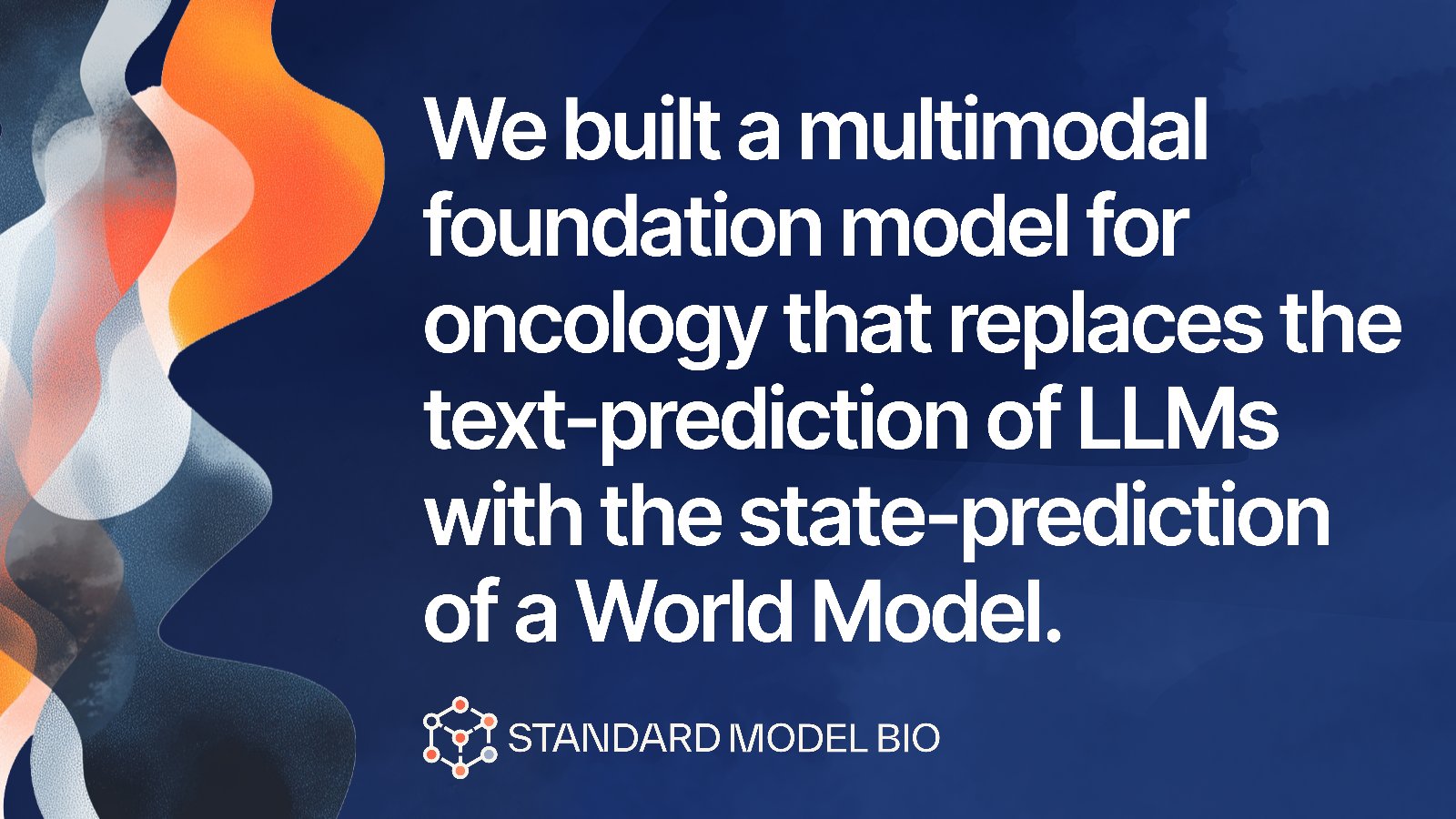
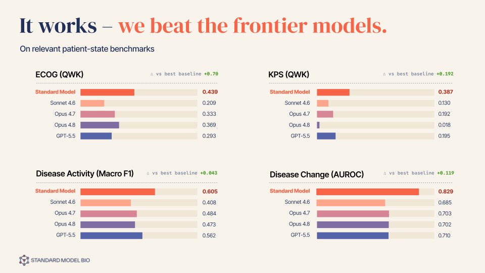
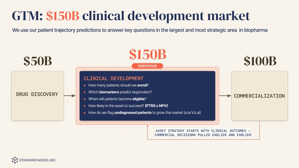
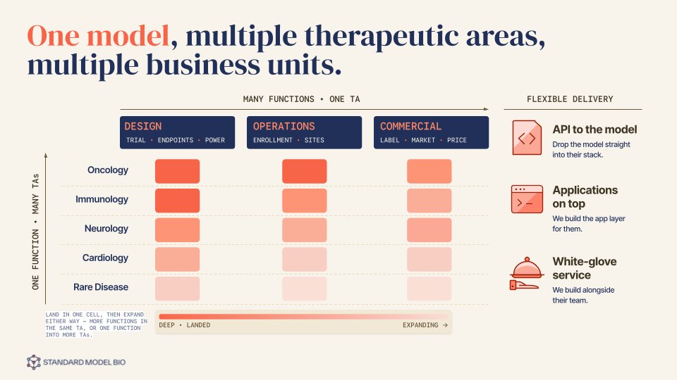
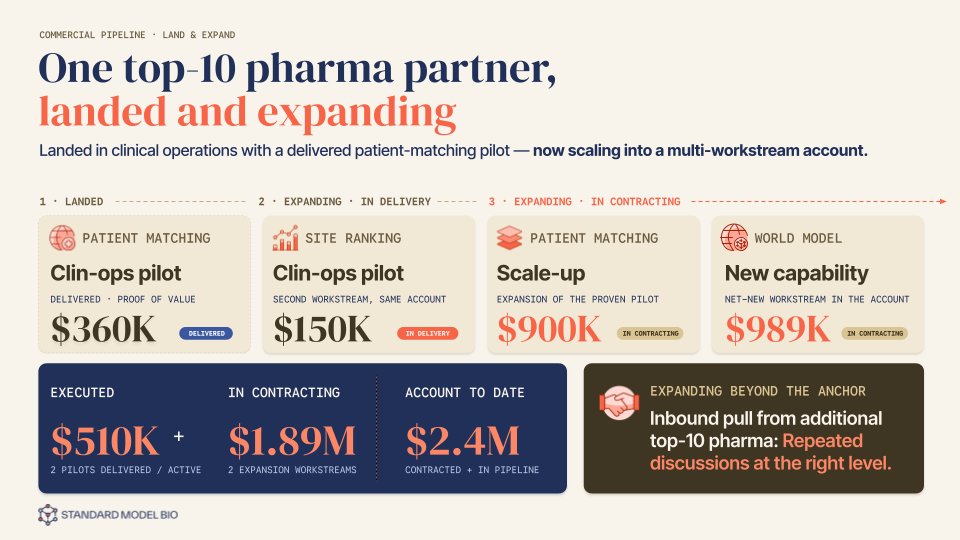
Pitch after pitch, on-brand from slide one.
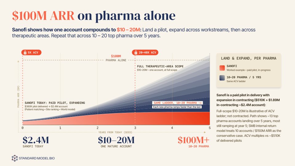
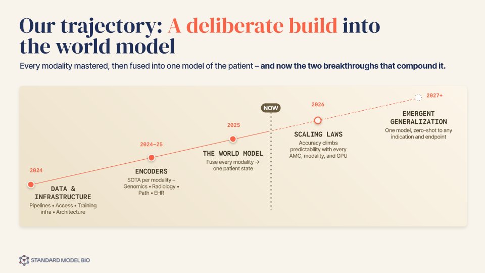
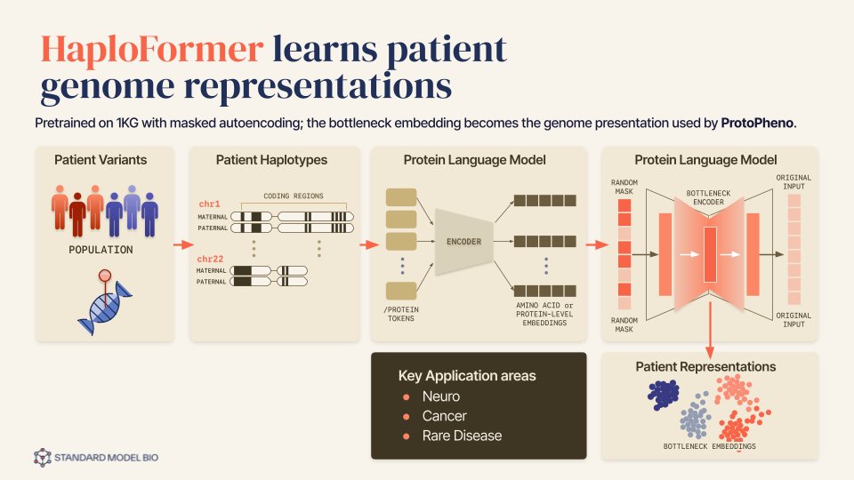
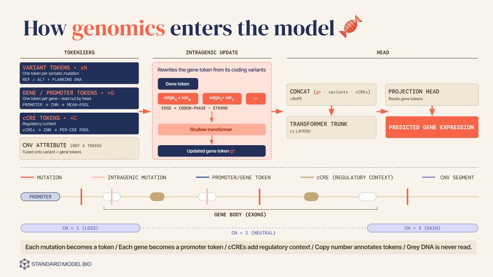
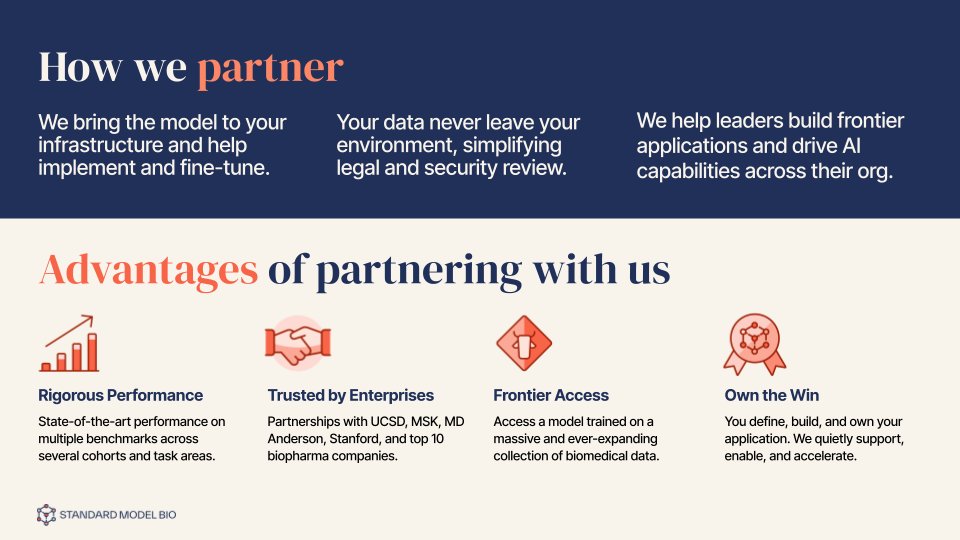
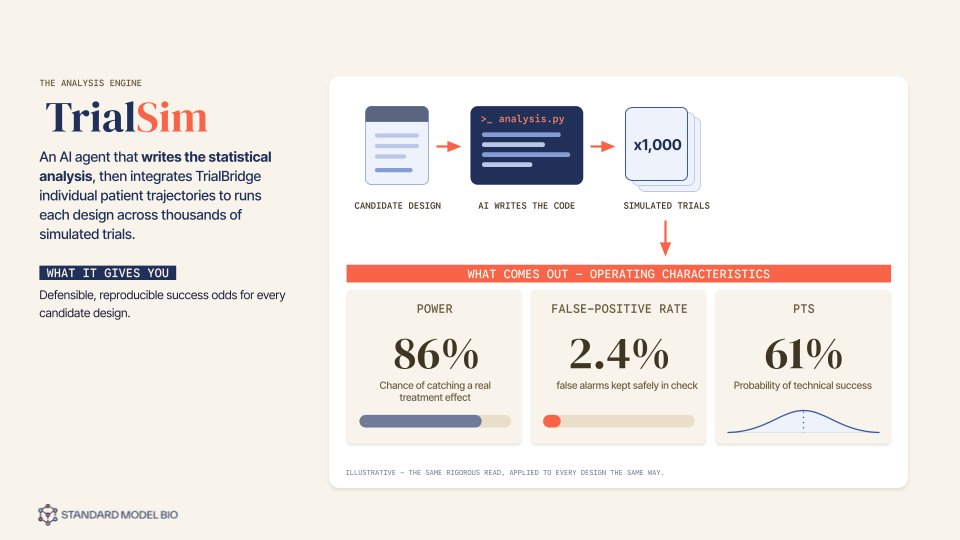
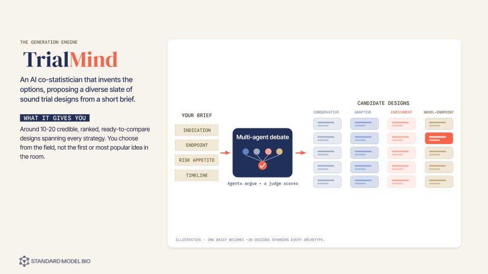
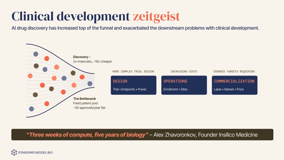
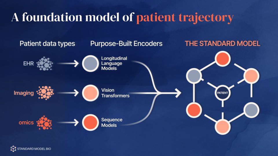
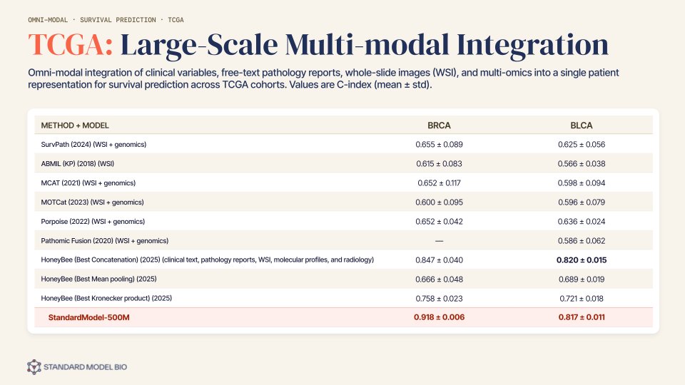
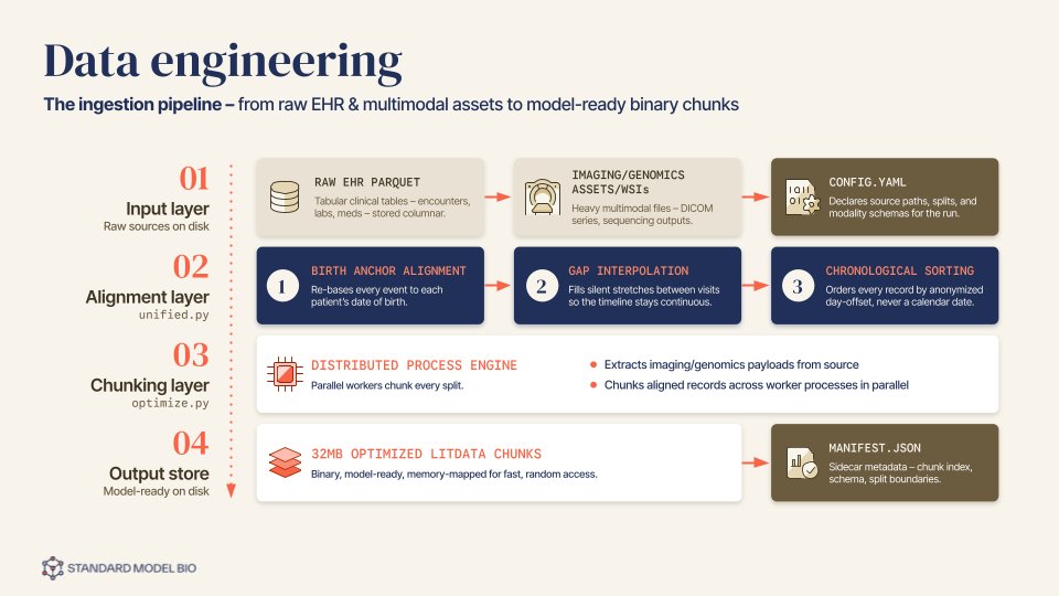
An ongoing program of investor and partner decks — plus the explanatory figures that carry the research into the world. Complex mechanisms, model architectures, and survival data, redrawn in the brand's visual language so a reader grasps the idea at a glance: rigorously accurate, unmistakably on-brand, built to make hard science legible.
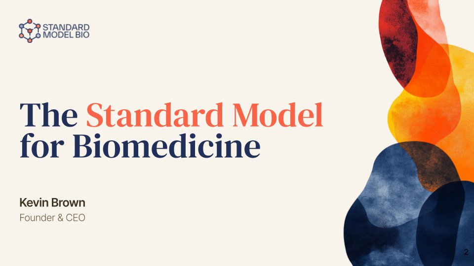
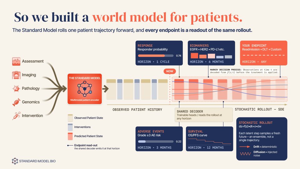
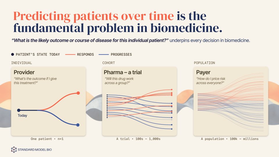
The system, set in motion.
Video is another surface of the system, so it's made the same way everything else is. This one began as a script and a rough video sketch from Standard Model's head of data science — the argument and the evidence were theirs. I took it from there: designing every frame, building the motion, directing and timing an AI narration track, then scoring and mixing the final cut. Just under three minutes, carried from sketch to finished film by one designer.
It holds together because it's built from the same parts as everything else: the Standard Model brand palette, the serif-and-sans pairing, the mono labels, the chart language from the decks. The data animates at publication standard rather than being simplified for motion, so it reads as the brand moving, not as a video about the brand.