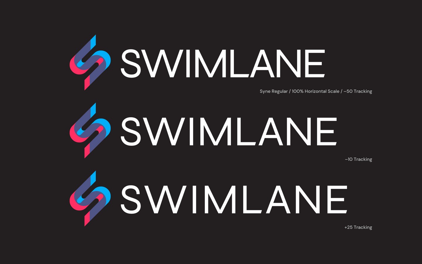
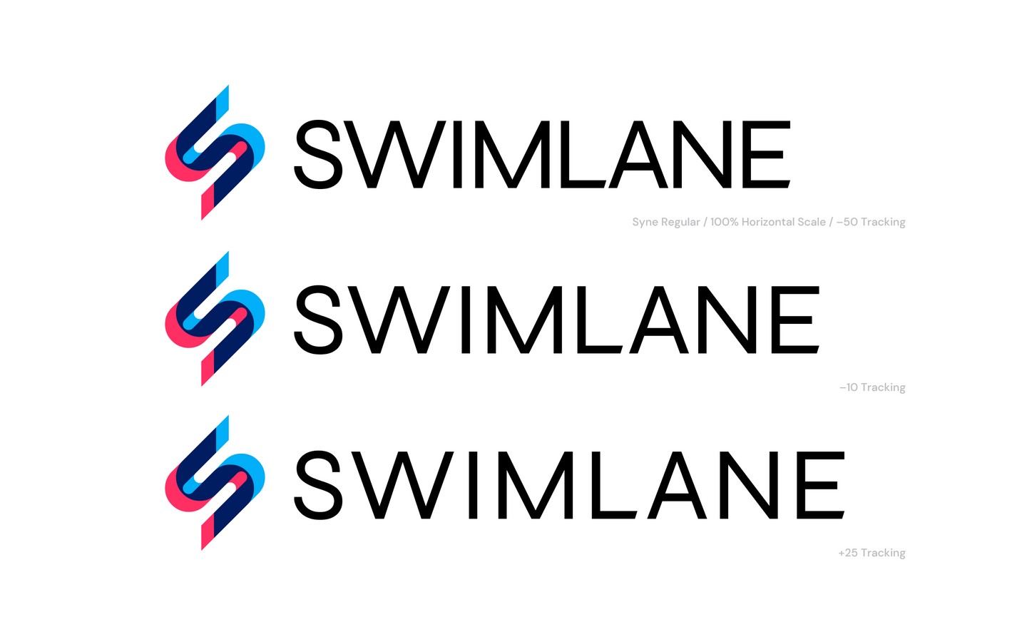
Swimlane
The centerpiece of this work was a new logo for Swimlane. Their old mark (the first image thumbnail below the hero) leaned generic — safe, but forgettable, and it didn't say anything about a company built on speed and precision in security automation.
I redrew the wordmark with a tighter, more geometric sans that reads as confident and technical without tipping into cold — every counter and terminal considered so it holds up at favicon size and on a trade-show banner alike. The mark pairs it with a faceted, gem-like symbol built from the same angles as the letterforms, giving the whole system a single consistent visual language.
From there I extended the new identity across marketing collateral and data-rich storytelling — translating dense security-automation workflows into visuals a buyer could actually follow, without dumbing any of it down.